Welcome to the development log for my final year game, Chasm.
Scroll down to read my log entries and see my progress.
You can download the latest version of the game on Itch.io
Thanks for looking!
Welcome to the development log for my final year game, Chasm.
Scroll down to read my log entries and see my progress.
You can download the latest version of the game on Itch.io
Thanks for looking!
For the events I wanted to make some promotional stuff to give out such as stickers, mini prints or bookmarks as a little thankyou for playing my game and so they can find my websites and social media. I also need to make a really large (2m long) image for the banner to advertise my game, so that’s going to take quite a while. I would have liked to have gotten some made in time for hand in but it seems like time won’t allow that : ) So I’ll be working on that in the weeks leading up to the events.
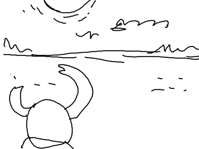
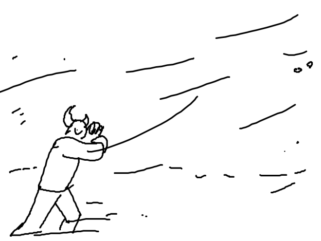
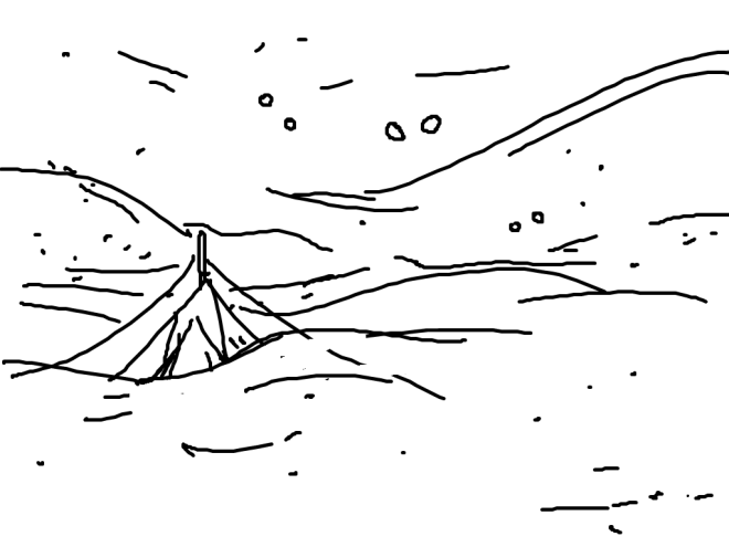
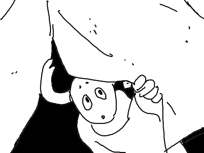
But I wanted to just get some of my ideas down in sketches, so here are some rough doodles of what I was imagining and brainstorming some possible things to make.

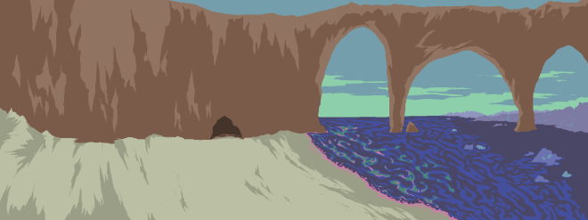
I then took one of my banner designs and expanded upon it digitally. I added some creatures in the background and made the landscape more three-dimensional to lead to the eye forward. The colours were quite tough to get right, as I wanted a more dramatic look with more eye-catching colours so I had to tweak the colours from my game to be brighter and more contrasting.
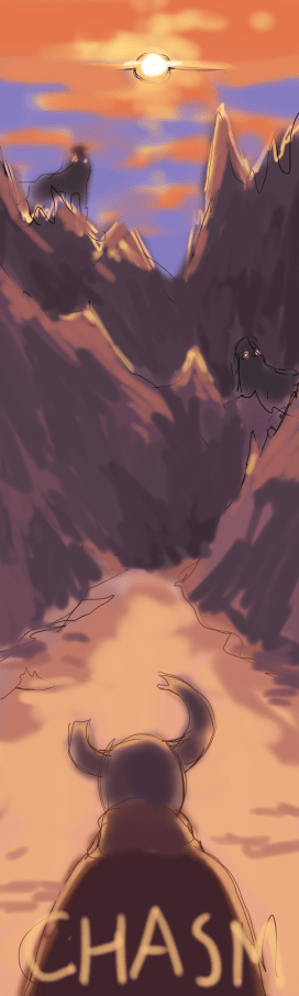
I think it looks quite effective and interesting. I wanted to include a hint of the creatures and get across the stifling and eerie atmosphere of the surface.
I wanted to make a Tshirt to wear to the shows so I quickly cut a stencil of my logo and used some fabric markers I bought from ikea a while ago (came in handy like I thought they might) Now I am looking at it in pictures I’m thinking that it might look a bit like blood, but I don’t have time to change it now. But after deadline, I will probably add some details or something in other colours to make it look not quite so much like blood.


I was doing a bit of thinking about what kind of things I want to give out at the shows, like postcards, stickers etc. and decided that I want to collect donations for an environmental charity either by ‘selling’ prints for donations or a sort of giveaway where people would donate say £1 and be entered into a giveaway for a bigger prize like a commission or the handmade plushie of Digby I was planning to make. Originally, I was just going to print some postcards to give out for free but I think expanding to include some more special items and asking for donations instead would be a good way to hopefully raise some money for a good cause that’s relevant to the themes of my game, which I care a lot about : )

I also sketched a little plan for how I’m thinking I want to set up my booth. My game is going to be in one of the arcade cabinets that the Uni has, but I would like a table to show some of the concept art, sketches and things to donate for such as prints. My cabinet is going to be printed a sort of brick red-y orange, but I was thinking I might paint some details on it with acrylics or something, like a horizon or stars or clouds or something, just to make it look a bit more eye-catching.
I did some research into some environmental charities, mainly ones based in the UK. I want to pick a good cause to donate to, but it’s hard to pick between them.


I forgot to mention that a few weeks ago I had a go at making some little cards to give out to people with my info and the info for the London show. These aren’t proper business cards as I haven’t had time to work on those, and I’m thinking I want to invest in a nice domain name before I print them, to look more professional. Hopefully I can get some better business cards done for the London show, but these should be ok for the moment, just in case I get the chance to hand some out or I’m caught needing to give me details to someone easily.

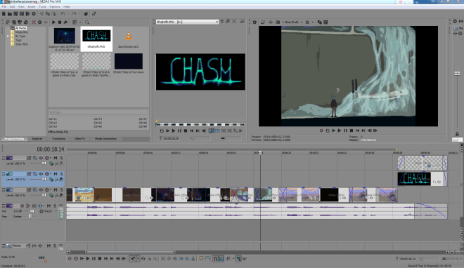
I used Sony Vegas to create a short video that showed some of my inspirations, process and thoughts. I really enjoyed filming the footage and compiling it with the music. I asked Sam if I could use some of his music to accompany the footage, he has a lot of music that he has made over the years so I took a look through and found some that had the right kind of vibes for my game – kind of melancholy but not miserable.
I then made a short trailer for my game, a little compilation of some of the more interesting scenes to show the different areas and atmospheres. I used some more of Sam’s music.
Also, I filmed a playthrough of the game for anyone who can’t get it working for whatever reason or doesn’t fancy playing it : )
Here’s a little screenshot of what the project looks like in Sony Vegas. I find it’s a really easy and intuitive program to use and would recommend for people that aren’t that technologically inclined. Basically all you have to do is drag and drop. : ) I think editing videos is actually really satisfying and fun and I’m glad that I’ve learnt the basics so that I can use them in the future if I ever want to make any other videos, maybe for youtube? Who knows…
I also recorded myself going through my project file and explaining the different objects and rooms and how they all work. It might provide some insight? Who knows…
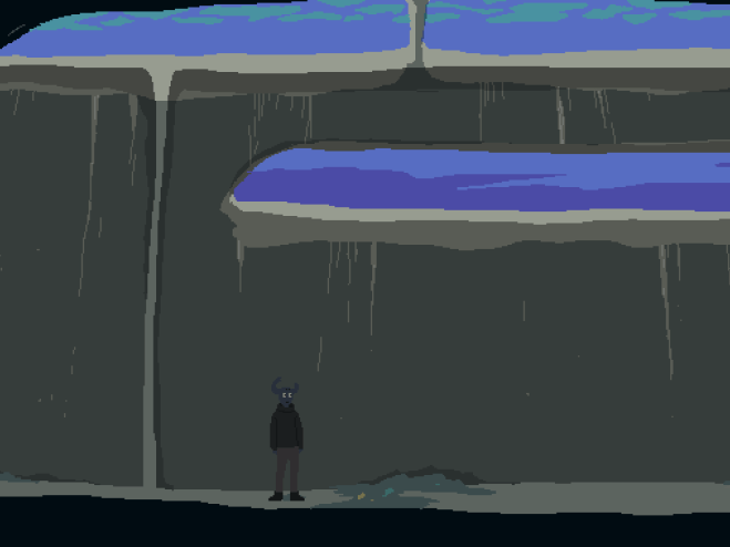
Here is the updated playthrough of my final version for hand-in. I updated a few things so it feels a bit more complete and professional.
Testing!
I arranged another testing session with some friends that knew nothing about my game, so they could be fresh eyes and give me some first impressions.
Here are some notes they gave me –
I’m glad they got what I was aiming for, such as the mystery and feeling a bit disturbed by some of the scenes, which is what I wanted. I like that they liked the art and how different the characters are. I do need to tweak some of the progression elements such as the button and key to let the player know what is happening. I quickly fixed the collision blocks on the maps so players wont fall off now : )
Sounds!
I used some ambient sound generators like Moodil and A Soft Murmur to work out the kind of mood I want in my game. For now, I am going to be using these sounds in my game but obviously if I were to release this game fully I would record my own sounds as I wouldn’t want to infringe on any copyright. I would not be charging any more for my game any way so I’m not sure what that would mean, but just to be safe I would want to create my own.
I had a lot of fun playing around with these sounds to create interesting atmospheres for each of the areas in my game. I liked the sound of the singing bowl as a sort of musical aspect but not too tuneful or repetitive, I think it sounds quite lonely and eerie as well. I used some wind and thunder noises for the surface and some quite murmuring of voices for Chasm city. For the under-lake rooms, I used a very quite wave noise, some static, some thunder and some more of the singing bowl to make a mysterious, claustrophobic soundscape.
I also used Bfxr to make sounds for the interaction and doors. It’s a cool online editor for traditional sounding game sounds. I fiddled around with it for a while and came up some decent sounding effects. They add a bit more immersion and make the game feel more responsive.

I also used the footsteps track from Moodil and edited it with TwistedWave online sound editor to make it a bit faster to fit better with Digby’s footsteps, about 115% speed. It is serving its purpose well enough at the moment but I would like to make a custom footstep sound effect better suited to the environments.

I made some sounds for each of the NPCs, like I planned to do ages ago : ) I just used Bfxr to make some lo-fi sounds that I felt reflected their personalities. Sounds like these are very reminiscent of old school games with 8bit soundtracks or the original Pokémon noises, but I think the lo-fi quality suits the pixel style of the game. You can hear them in action in the playthrough below…
Polishing!
I added some more details to some of the backgrounds I felt needed some.
I also updated these two backgrounds to have a more refined style. I was originally going for a more geometric look with the environments, but as I went on with drawing them they gradually got more naturalistic and detailed which I actually prefer in the end, as it adds more believability and immersion. The strangeness is more in the stylized characters and the slightly off block colours.


When I uploaded my latest build on itch.io I received some feedback from a user with some really helpful points on how to make my game better. Some things will have to be worked on after the deadline for the shows though as I’m not sure I have time. But I will definitely work on including more interactions and things to look at, which was one of their main points. Also adding an ending screen to finish the demo and thank them for playing, this will probably be quite easy to do, but if I can always do it for the shows in the end.
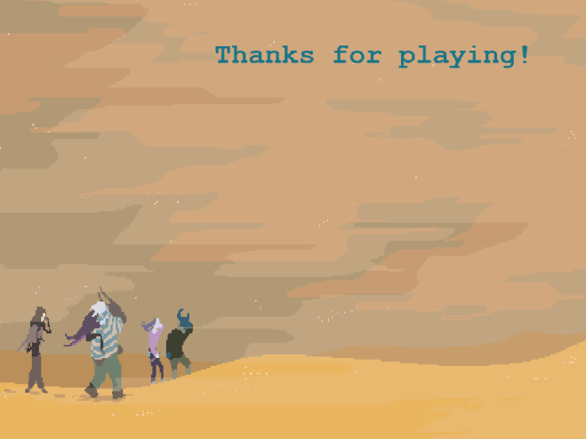
Ok so I just added an end screen that will come up when you press E, which at the moment would have to be done manually. But ideally I would like it to fade up after a certain amount of time but I’m not sure how to make things happen in time in Game Maker so I will have to research that. But for now I can just manually press it when they have reached the last scene and give them a postcard and some stickers or something as a thankyou for playing : )
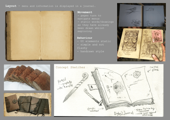
I really enjoy ‘journals’ in games that are gradually filled out as the main character goes on their adventure, and I thought this idea would fit well with my game idea to serve as a kind of travel log which will hopefully be another entertaining level of storytelling.
Here’s the design board I made previously which I will be using as reference and inspiration whilst making the assets. I’ll be using the same method of code variables that I used to set up the doors and obstacles in the game. So once the player has encountered something in the world a drawing will appear in the journal along with a little comment from Digby.
Also, I have been reflecting on one of my relative’s comment during testing that I should include larger more detailed images of the characters as they would like to see them closer up. I have been thinking about how to incorporate more character details and I decided that I could make a second journal page that you can flip to that shows Digby’s impression of each of the other characters as well as some drawings of them. I thought that would be quite a characterful and cute way to show more personality. I also would like to add some larger character portraits when interacting with them in dialogue, but I have yet to decide how that should be yet, if I have time to implement it.
I created two journal page backgrounds and set them up so that they would serve as a kind of pause screen, so by pressing a key you can go to the journal and then pressing the left and right keys flips between the pages and another key returns the player back to where they are in the game. At the shows, I will encourage players to keep checking the journal so see if there is new content.

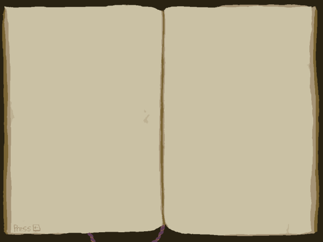
Here is what the journal looks like when it is filled, I drew the images seperately and created them as objects which are created in this ‘room’ when the player reaches certain landmarks. I like how it looks so far, I just want to add some little notes around the images to give the players a little more insight into Digby’s thoughts.
And here is the finished version with notes. I didn’t include a note on the top left pic as I felt like Digby wouldn’t know what to think about the fact that there were another people different from themselves. They are an upbeat character and I think facing that sight would leave them pondering and unable to form thoughts.
Here is the finished character page. It would be updated when Digby and the team first reach the hub room and settle down. I want the sketches to look like observational drawings, with some being candid and otto trying to sit still for Digby to draw and feeling awkward. : ) Hopefully I got some character and personality across. In the final game, there would be many more pages with more sketches throughout the course of the player’s journey.
I completed all the cutscene frames so that the game’s premise is set up and I can work on the later sections. I used a more detailed, higher-resolution pixel style to better convey what I wanted. I kept the shapes simple and focused on texture and colour in the landscapes and expression and body language of the characters, to hopefully portray a lot with a streamlined style.

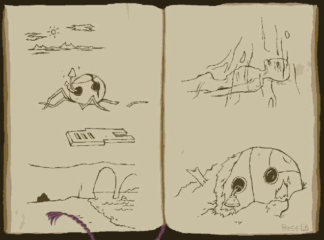
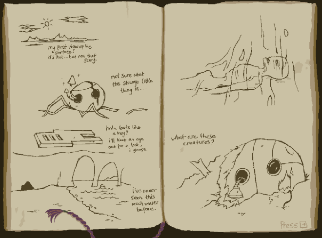
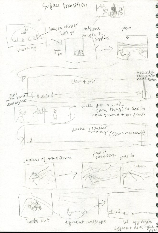
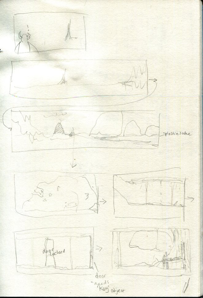
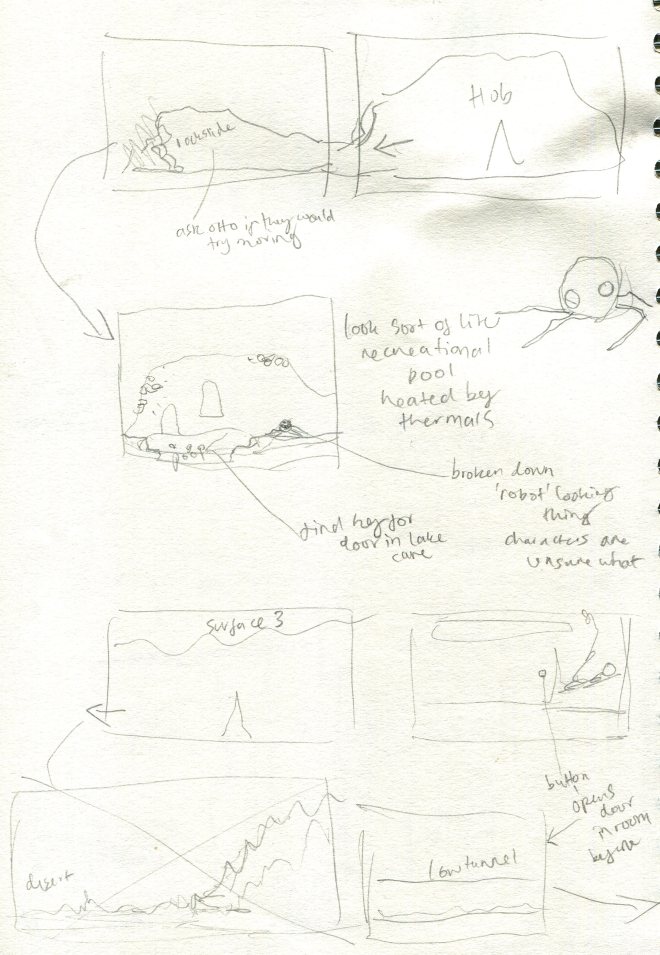
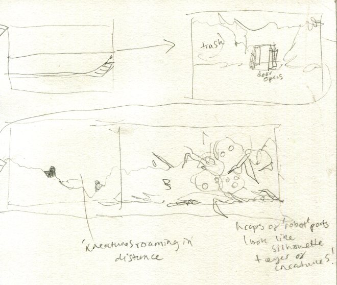
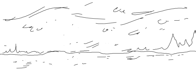
Here are some of my preliminary plans for how the surface map will work and which areas to create, and some sketches for the cutscenes. My sketches are really messy but I know what they mean : )
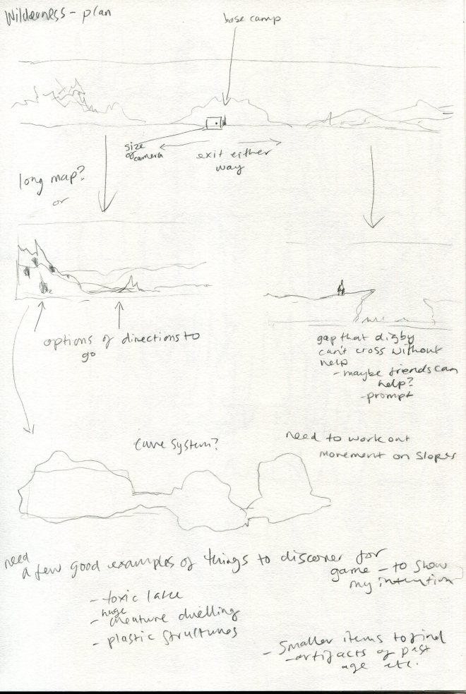
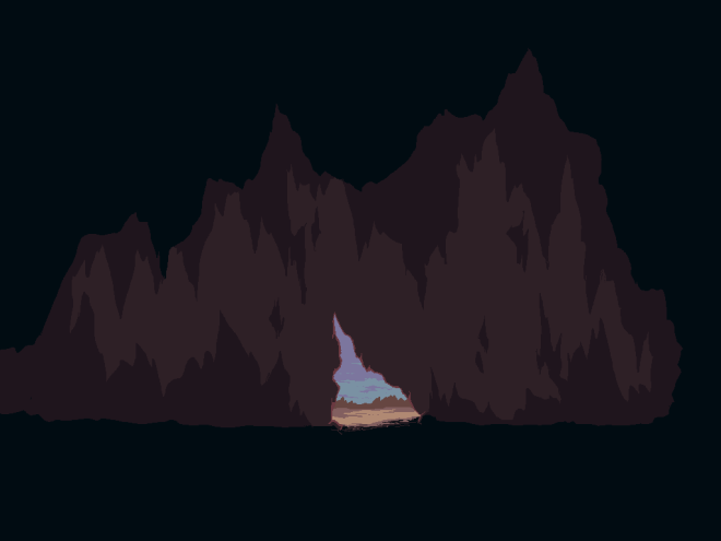
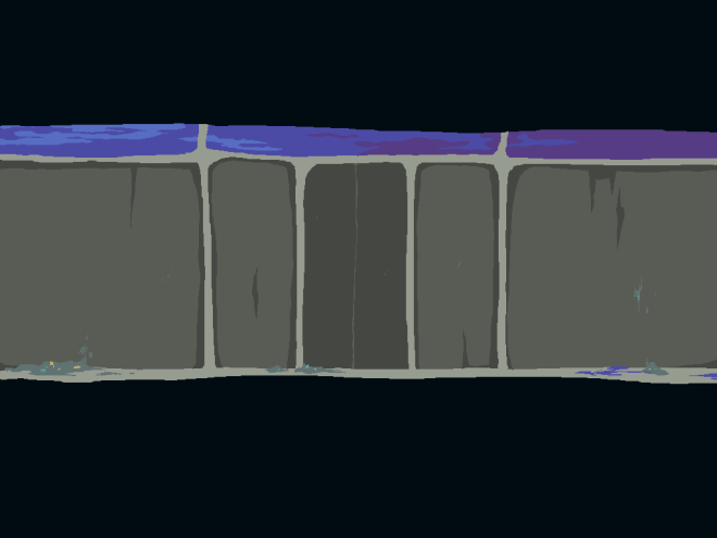
After expanding on my initial level plan, I started work on the remaining backgrounds using the same technique as I used when creating the backgrounds of my initial test build. I do feel that, as I have completed them, the later ones have gotten somewhat more detailed than the earlier ones and I will have to go back and tweak some to make the overall look more cohesive.

My aim now is to complete a rough version of the entire game, setting up the rooms, cutscenes and interactions and slowly upgrade it to final assets. I find myself wanting to make the game in a linear fashion, so that it looks somewhat presentable but I really need to get all the foundations down so I know the structure of the game and the full story.
I am currently working on blocking out all the rooms and sketched the cutscenes I want for the first transition from Chasm city to the surface. I’ve set up rooms in Game Maker that mimic cutscene frames (the easiest way I could think of to manage it), and with the fade to black between frames it looks quite decent.

I sketched out the basic features of the next few backgrounds to get working.

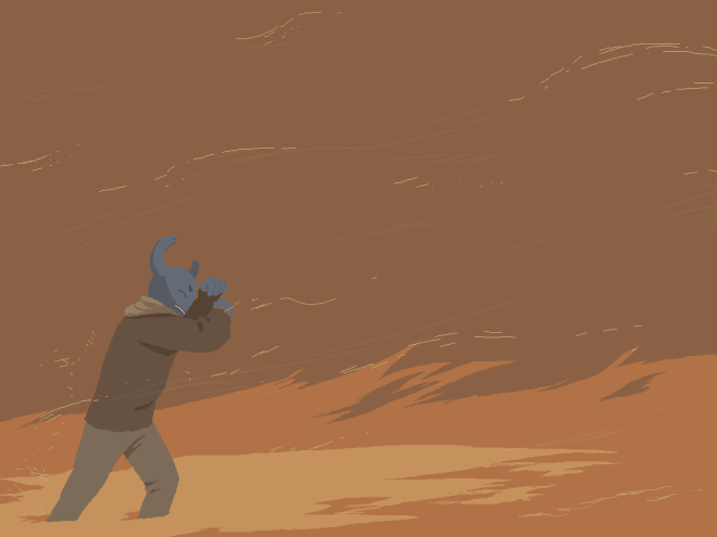
I worked on some of the main backgrounds as a break from coding (also because I couldn’t help myself and wanted it to look somewhat atmospheric). They aren’t quite finished as I need to add more details and objects to interact with but the general look is there. The colours I’m using are slightly unnatural and quite saturated to add the slightly strange and hostile atmosphere. I want it to look a little radioactive and hazardous.
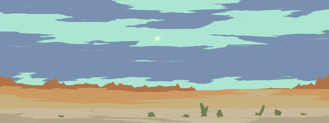
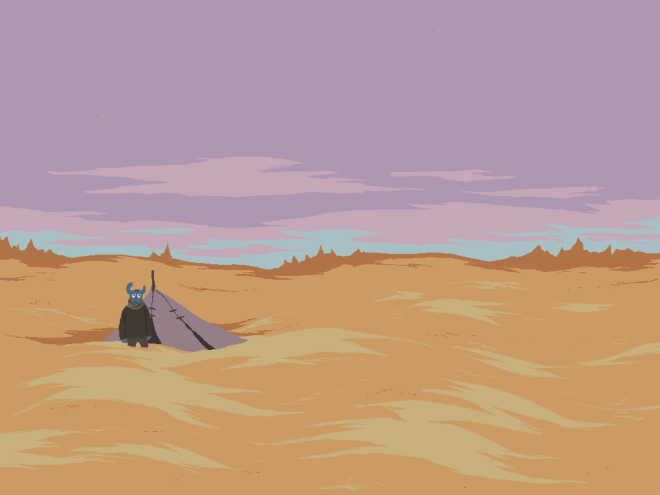
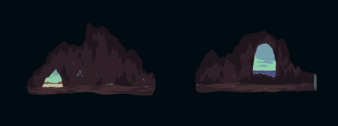
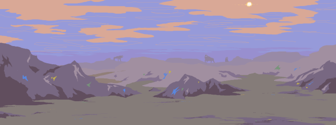
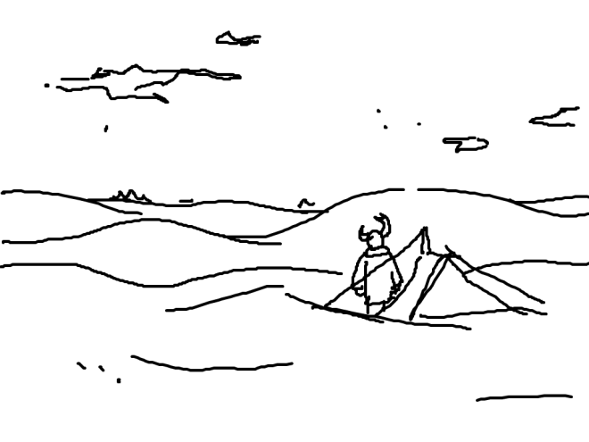
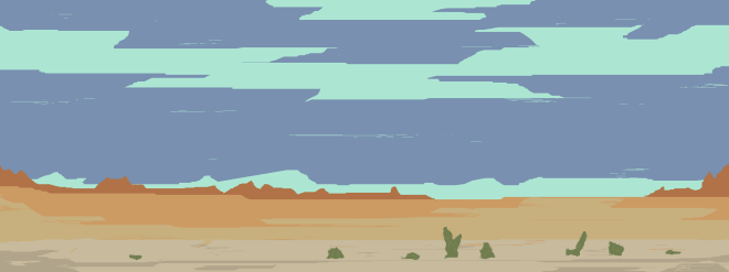
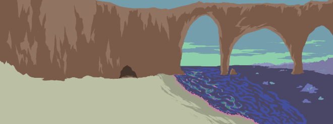
The first image is the player’s first look at the surface so I wanted it to seem quite pleasant and get progressively more hostile looking and dangerous.
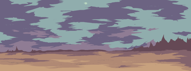
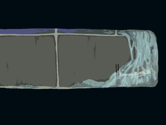
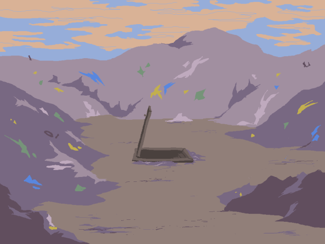
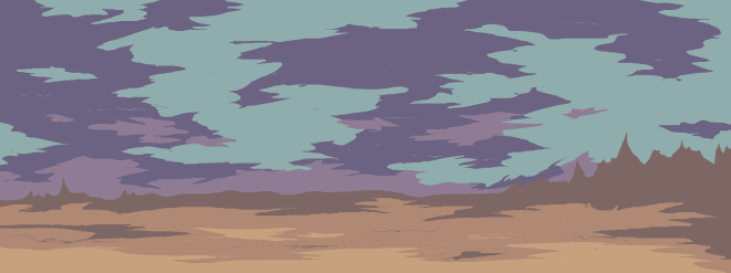
The second image is when the world gets a little stormier and more angry before the sandstorm hits (which will be shown in cutscenes). I emphasised the purple, bruise-like colour and the landscape gets spiker to look more aggressive.
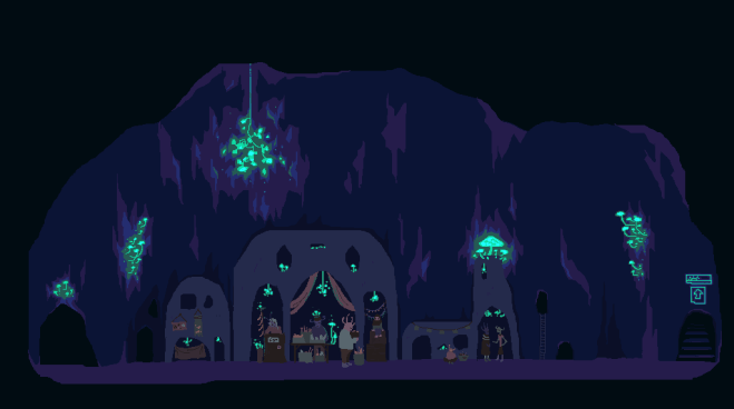
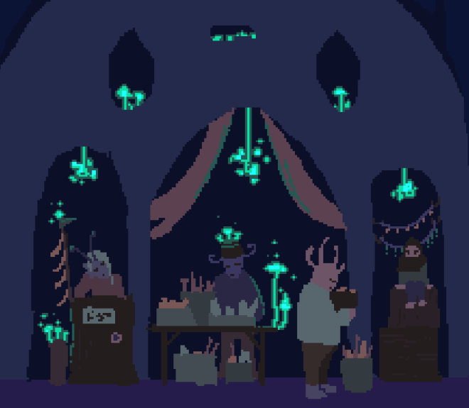
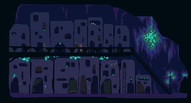
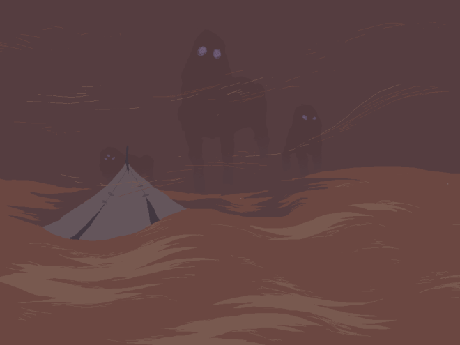
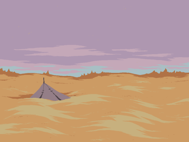
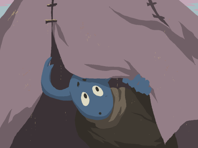
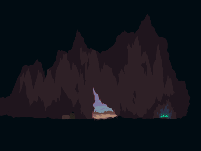
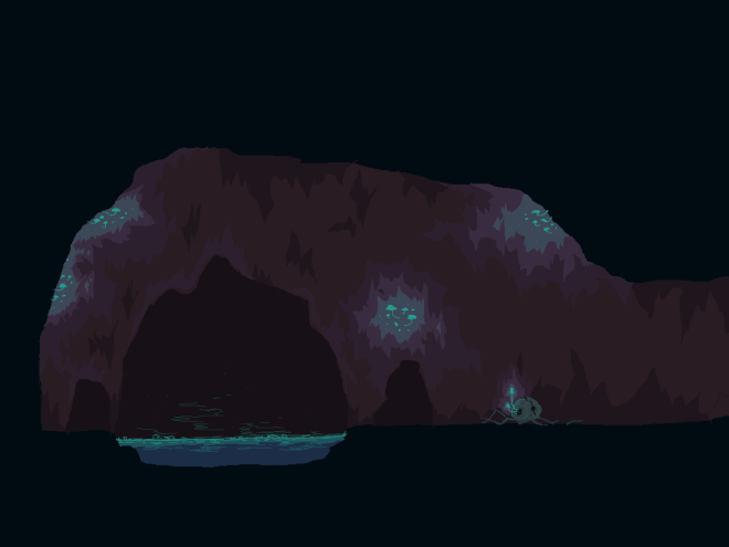
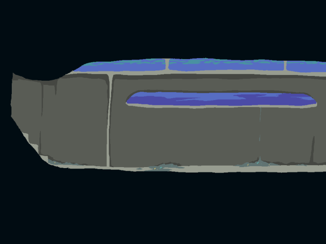
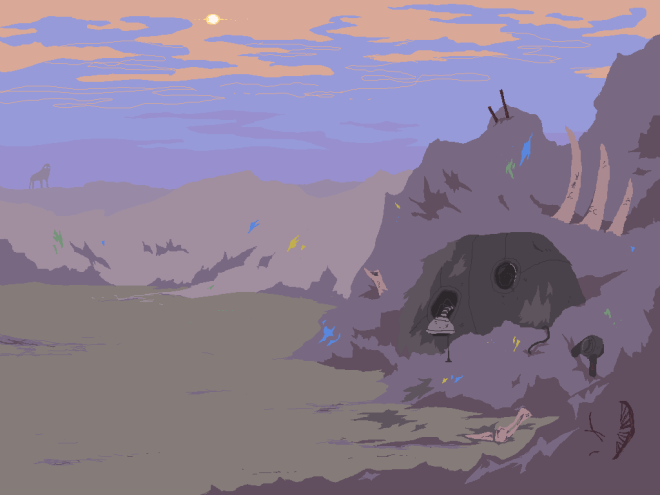
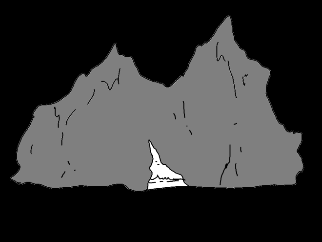
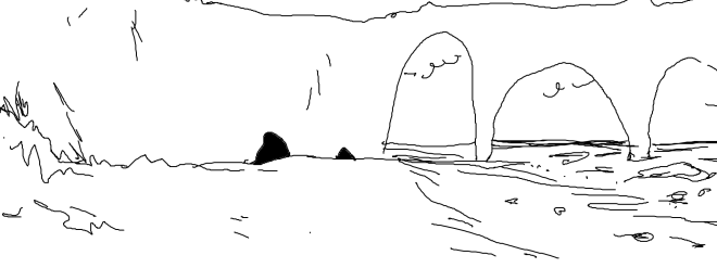
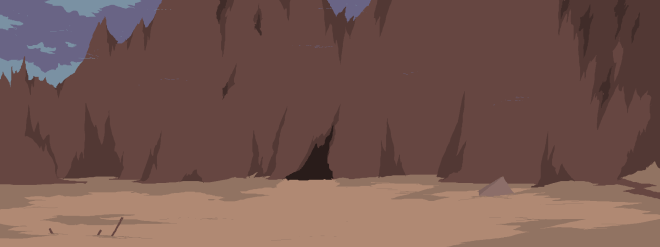
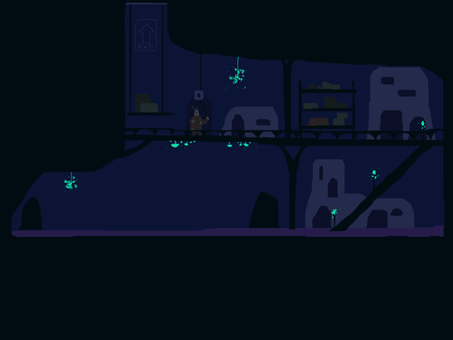
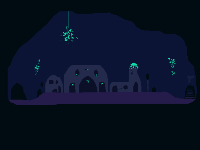
The third image is after the sandstorm, in the morning. The previous landscape is transformed and the landmarks (when there are some) will be gone. The player enters the cave which will be established as a new settlement.
The last image is past the new hub-cave, down the rock formation towards a lake or perhaps a sea as you can’t see the other shore, only the heaps of partially decomposed plastic. The plastic has turned the water toxic and given it the trademark rainbow colours of petrol-spill. I received some feedback from my brother about how the plastic mounds look like more land and perhaps to add brighter colours to make it more obvious. I was aiming for it to look like the colour had leaked out over the years but it should look more obvious, so I will work on that.
I have added new instances for the NPCs in the new areas, with new dialogue lines which will hopefully reveal more about their character. Once reaching the hub-cave, they will stay there and will have new things to say after Digby explores more areas of the world.
Here is a link to a video of how the current build is looking. If you want to have a go at it then I have uploaded it to itch.io too – here
For the first user testing session, I really wanted to create enough of the game for the players to get a good idea of the premise and concept. I wanted to create what will essentially be the first section of the game, that provides the set up to the rest of it, which will take place on the surface. Obviously, it will not be as polished as it will be at the end, but the essentially function and sequence should be the same.
I made a basic first section to show the premise, from Digby’s home – where they receive a letter informing them that they were not successful in their farming application but have been invited to be a part of a new mission, the player then sets out to met the sender of the letter in the surface preparation room to find out what the mission is. The player will see a brief overview of the city and meet the NPC who lays out the basic premise of the rest of the game – to establish a new settlement because Chasm is becoming overpopulated.
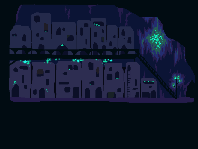
I created some basic backgrounds without shading or much detail just to give the player a decent idea of the space and kind of place that Chasm is. I will refine these later with background characters, details, objects and some NPCs to interact with.
Here’s a playthrough of how this version is looking, ready for testing. Excuse the ugly watermark, I need to find a good screen recording software.

Here’s some of the feedback I received during the first user-testing session.
From the feedback I can see that I need to work on portraying the interact-able objects more obviously, defining which ones are interact-able and which ones are just decorative. Although I don’t want to discourage exploration, but it could become frustrating for the player to miss things or get tired of trying to interact with things and nothing happening.
I’m glad that people enjoyed the dialogue and found that it introduced some mystery, which was my aim.
I need to think more about including any other mechanics and how to code them. I want to include a stamina mechanic that drains the longer you spend on the surface and I did want some interactions between the player and the mysterious creatures on the surface but I’m not sure how in depth I can manage.
Fergus McNeill, author and interactive narrative designer, visited to chat with us about how to write successful, impactful stories and give us some feedback on our game narratives. I discussed what I wanted to achieve in my narrative, and how I could tweak certain aspects to make it more effective and purposeful. He gave me some advice on how to keep the player interested by refining the driving force of the main character to something stronger than just a want, or because they are bored. I think I can change some aspects of the set-up of my game, the reason Digby wants to go to the surface, in order to make it more powerful and relatable. He also urged me to look at what I really want to convey to the players and what I want my game to be. I think I have got caught up in trying to keep the plot relatively minimal, as I’m worried about whether I will be able to achieve it working by myself. But really, I should be going for what I really want to happen and if it doesn’t work out perfectly, then at least I tried and didn’t water my ideas down. I don’t think I’ve been letting my idea evolve as much as it could, as I’ve been trying to keep it tied down to my original idea. But, really, I just want to create something with a cool world and memorable, fun characters. I said before that I wanted to keep the environmental message subtle but it’s been in the back of my mind as something I need to focus on more than other aspects.
Characters are, for me, the driving force of a story. When I read/watch/play things, I can think the world-building is interesting and the plot is engaging, but if the characters are weak then I feel no attachment to the story. For my game, I really want the characters to be the central focus of the narrative. The plot keeps the game flowing, the world provides context, along with some environmental messages. I want to make the environment almost a character in and of itself, and I want it to be immersive and intriguing. But the feelings I want to get across to the player will mainly be delivered by the characters – working together against adversity, community and inter-connected-ness – essentially ‘friendship is magic’ : )
I need to have a think about how to change certain aspects to make the story more powerful, and include more ‘peaks’ and ‘troughs’ for the characters. I’m debating as to whether to add more to Digby’s reason to want to go to the surface (to be noticed and be a ‘hero’), on the one hand – it shows their idealistic nature when compared with the other team members, who have been banished or been driven by unfortunate circumstances. I think it might show Digby’s naive, self-centered nature when they find out the other member’s reasons for going. However, on the other hand, if I start with a more vague reason – just wanting to go – then will it keep the player’s attention? or will it just be lacklustre and not urgent enough? I’ll have to think.
After talking with Fergus, I think including some more dramatic scenarios throughout the game, rather than just passive observation and exploration, would give the story more drive and purpose, and keep the interest of the player more. I will have to think how to include these, whether through gameplay or cutscenes?
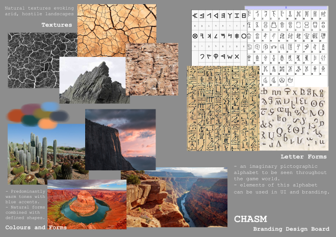
I need to design an identity for my game for things including UI, marketing, logo and promotional material. I began by making a few design boards of inspiration and references to get an idea of what I want and to keep me on track when going further.
I had some ideas about how the UI would look in-game. I would like a the information the player gathers such as landmarks, interesting objects, creatures, clues etc. to be drawn in a ‘journal’ that will fill out as the player discovers more things. I found the journal in Red Dead Redemption 2 to be super charming and a really nice, simple way to deliver more thoughtful information about events and landmarks which also reveals more about the main character in turn. The Uncharted series does this too, but Nate’s drawings are always a bit too good, whereas Arthur’s and John’s drawings from RDR2 have much more personality and they each have different ways and skill levels of drawing which is such a nice detail that really gives their gruff characters some likability.

Because the bug people have no livestock, a leather journal wouldn’t be reasonable, and I had heard of a kind of leather made from plant matter so I thought that could be a process these people use to make more hardwearing materials from fungi and cacti.
I made some sketches for a possible logo for the game. I’m really not great at typography and usually just use the same few fonts but I want to try and make hand drawn text in a pixel style similar to the game. I sketched out a few ideas but only really liked one of them enough to continue, I think I need to have another go at sketching some more ideas as I’m not that sold on any of them.

I took this idea forward, mainly just to try out some ideas for some possible lettering effects. I wanted a somewhat pictographic font like the one I am planning to make for the game world to add some interest to the world, but as I haven’t designed that yet I might give logo-designing another go afterwards and see if it comes out better. But for now, I thought I may as well try and make something usable just in case I run out of time.


Alex Ayling, a musician, came in to talk to each of us about what kind of music and sounds to include in our games. He advised me to keep the music simple and ambient for my game as to not distract from the visuals. I want some simple atmospheric sounds and perhaps some ambient tones for music, but nothing too modern/electric sounding and not too much melody which could get annoying when exploring areas. I really like the atmosphere of the Yume Nikki soundtrack, specifically how it sounds a little static-y and lo-fi, which works well with the pixel style of the game – I think this might work well for my game too. Natural sounds such as gentle percussion and string instrument tones with a slight digital filter over the top so that it meshes well with the obviously-digital pixel style of the game but still fits with the technologically undeveloped world.
Alex also mentioned having some individual noises for each of the characters to add personality and differentiate them. I hadn’t really gotten round to thinking about character sounds but it makes sense and would be a nice detail, so I’ll think more on the kinds of sounds each character would make.
I’m planning to gather sounds from the environment with a portable recorder, which should be fun and sound better and be more custom for my game, rather than just using stock sounds off the web, which are no doubt very overused in indie games.
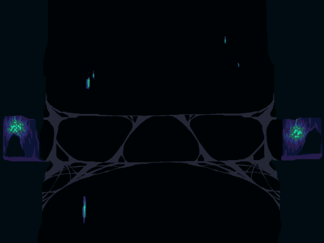
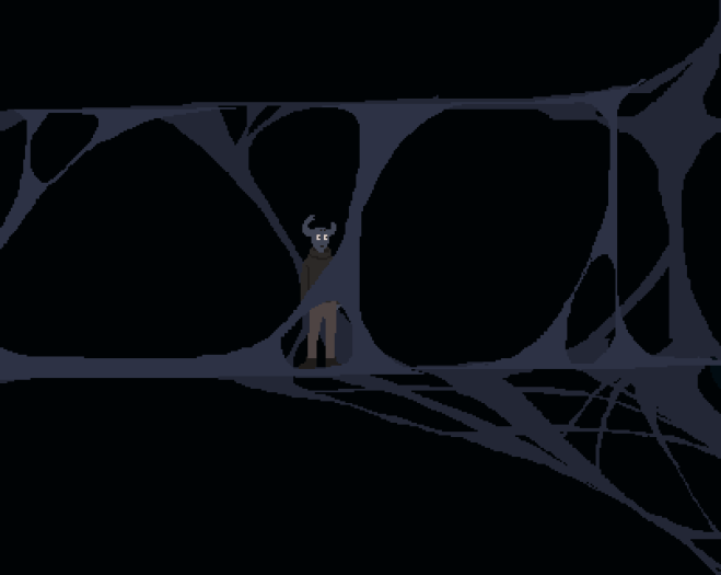
I started on the background for the next room, a bridge connecting the two sides of the city across the chasm. This is the basic design, which I will add more detail to later. The bridge is made by spider-people. I wanted a foreground section of the bridge to make it look like the player is walking through it, so I made a separate layer that can be added as an object on top with a depth modifier on it to make it appear in front of the player.


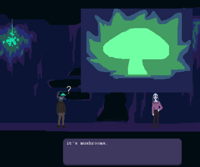
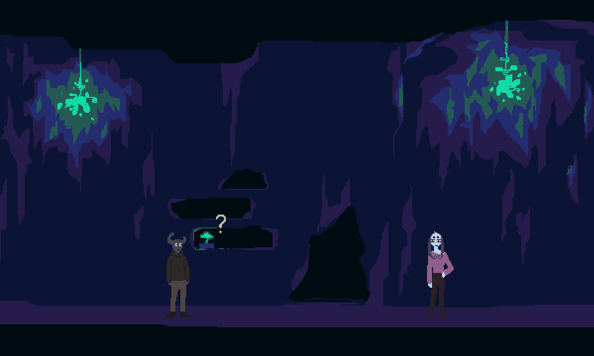
I also added a feature that means when the player interacts with an object, a large detail shot of the object will appear to give the player a closer look. This is just an ugly placeholder for now, and I would like to add a border to the image as well, but the idea works.
It’s time to get this game made. I made a rough prototype for the movement and game set up in the last semester and my plan is to expand and tweak that until I have the basics set-up as well as I can, then move onto building the environments with assets. Hopefully, by building a bare bones version of the game and gradually adding layers of finish, I will end up with a well-rounded playable ‘minimum viable product’ that I can work on to polish into the final result.
First I added a place holder background of the room shape and made the floor objects invisible to simulate that the player is walking in the background image. I think this approach will be much more natural-looking and also much easier and more efficient than trying to create an automatic tileset for each area style. I tried this during the prototyping stage of last Semester and it was a lot of hassle, the method works well for creating many levels quickly for games like Mario for example, where the focus is platforming, but I want my environments to look designed and hand-drawn with a natural look, and I don’t need any platform elements as the player can only move side-to side so I wouldn’t make sense to use tilesets.

This is what the room looks like in the editor. The black lines are the floor/wall objects which are invisible when the game is running.

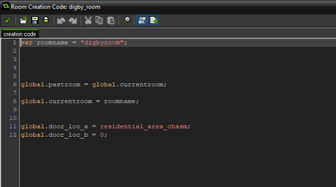
I had to work out an efficient way to change rooms and I managed to think up a good way using variables to change the target room of some stock ‘door’ objects so that separate doors wouldn’t have to be created for every room change, that would be hectic.
*** insert sketches of door idea and world layout
So now I have a little bit of code that changes the variable for current room and the targets of ‘door a’ and ‘door b’. So now all I have to do is change to target for the doors in the room creation code.
I had the movement and collisions sorted, along with a player sprite and a basic interaction with an npc that bought up a system message with some dialogue – not the most ideal way to deliver text. So, I had to create a system for textboxes and individual dialogue for the npcs and also some internal thoughts from Digby when interacting with various objects or places.
I used this tutorial to get the basic set up for dialogue boxes.
This took quite a lot of tweaking and testing but it works well now and is set up to be easily customizable for individual changes between NPCs and objects etc. Here’s a video of how the boxes in action. Using the tutorial I achieved the ‘typewriter’ affect and a skip function too, which adds a little more polish and makes it look pretty legit I have to say!
I also added a custom view. I used this video for a quick overview of how they work.
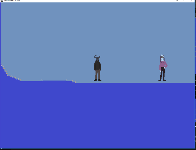
These are my current settings. I initially had it following the player object automatically with the setting at the bottom of the view menu, but the problem with this is that the player was forced into the center of the screen and you couldn’t see the top of the room, it felt really weird and unnatural to play.
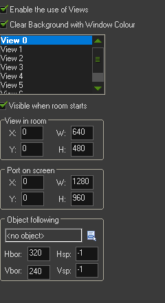 This is what it looked like.
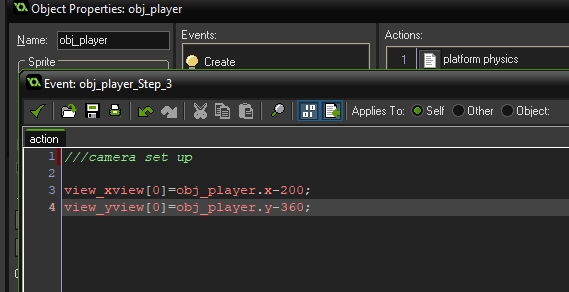
I wanted it so the bottom of the room was about 75% from the top of the screen, so I had to create some code to tweak the view settings. This is the short bit of code I used, it’s attached to the player object so it will affect all the rooms without me having to change the view settings of each one individually.
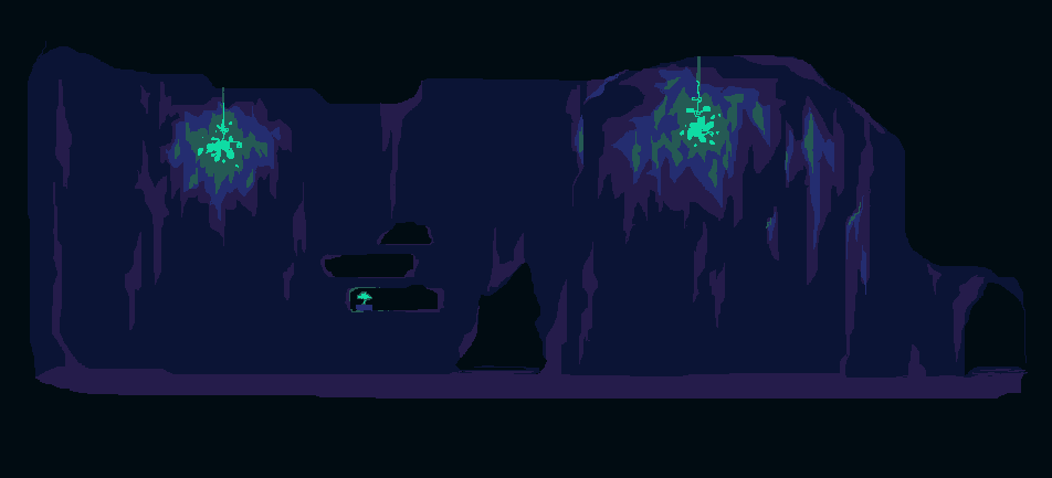
So, now it looks like this. Much better, I think.

Next, I created a quick background that is more like how I want the final version to look, it’s not complete as I want to add more elements to it such as furniture and decoration but I just wanted to see if this method of implementing backgrounds works before I commit too much time to the assets.
I used the altered images from my cave-home mood board I made last semester as reference for the colours and I really like how they look. I would to have the character sprites change colour to reflect the surrounding lighting and environment, so I will have to work out how to do that later – should look cool. I would also like some animated elements in the environment, which may have to be separate sprites over the top of the background. I need to have a go at that and see how it would work.
Here’s how it looks when the game is running. Pretty good!
I then went on to tweak the look of the boxes and customize the method to create another box for Digby’s internal thoughts that will be triggered when looking at objects etc. – I wanted this box to be different from the Npc boxes and appear in a set place at the bottom of the screen. I also used the same collision principles to add a little ? that appears when the player walks past something that can be interacted with. Here’s how it looks so far…
